Alvara House
Project Overview
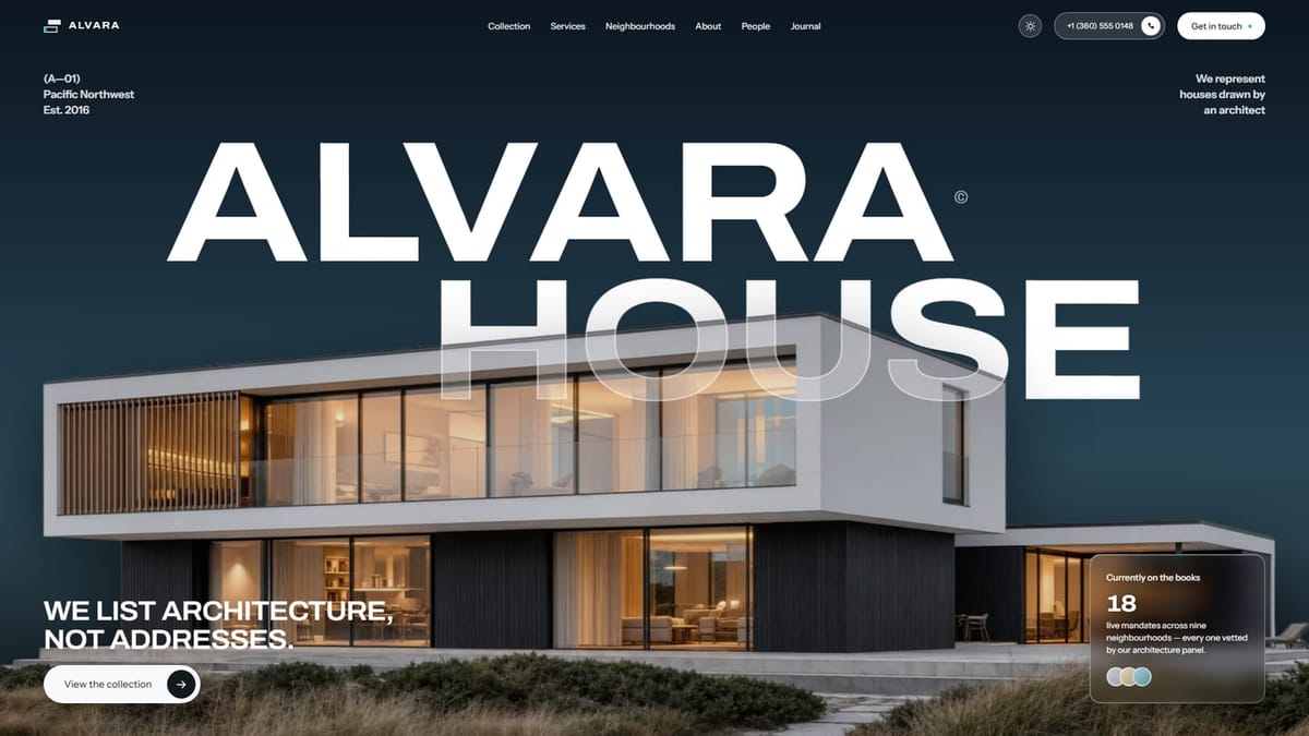
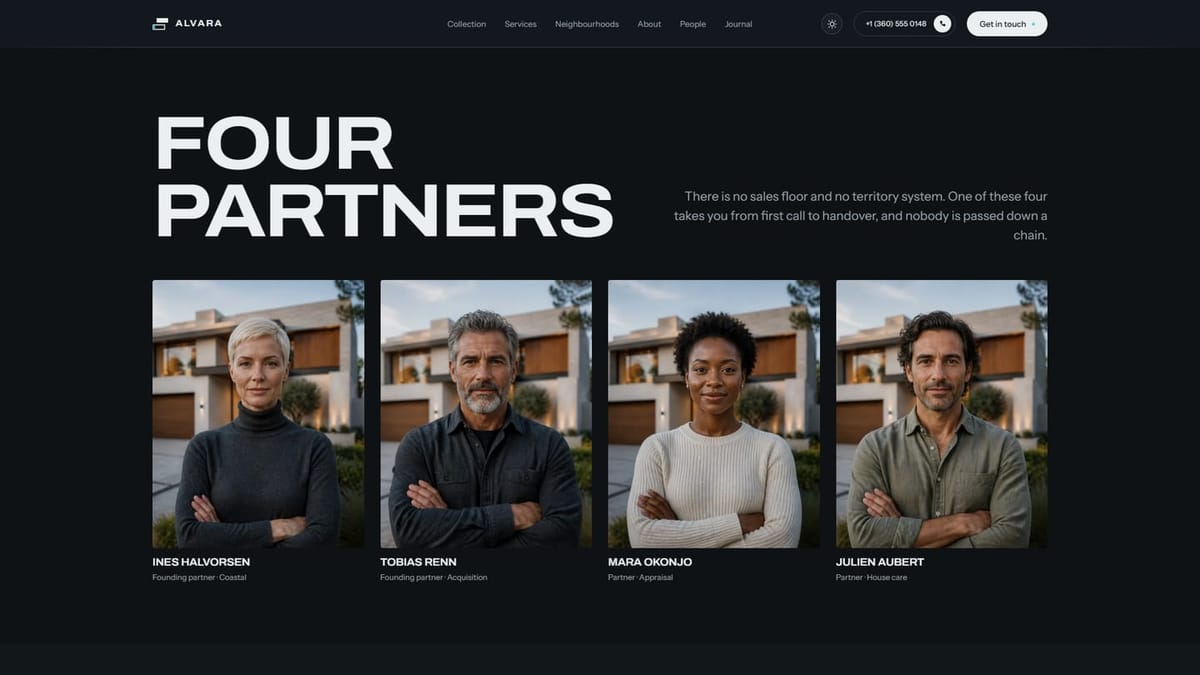
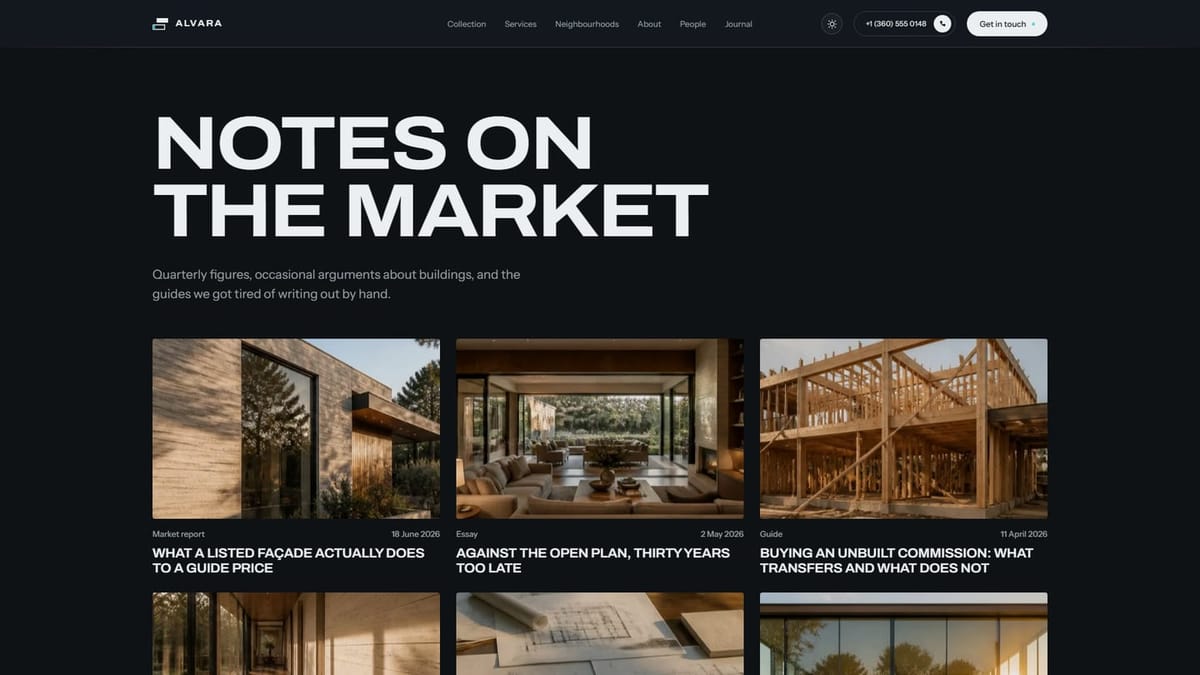
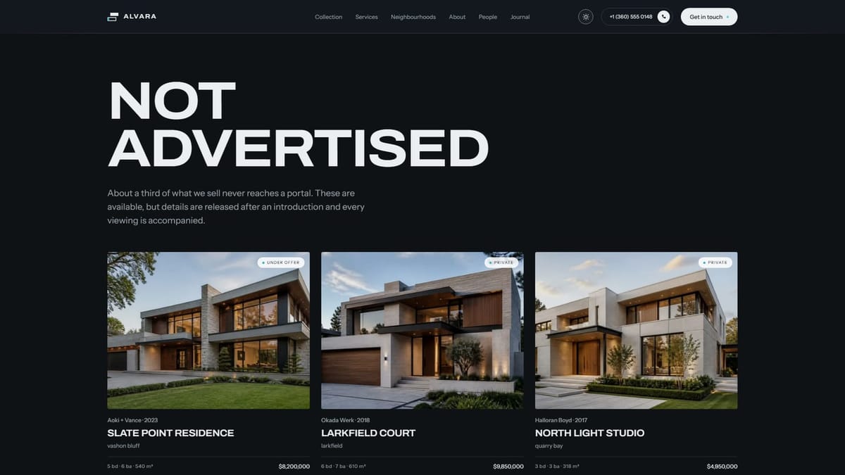
A sixteen-page property site built from scratch in Next.js, with a complete light and dark treatment. It covers a property collection, individual listings, neighbourhood guides, partner profiles, a journal and the enquiry flow — all sharing one editorial type system.
- Industry
- Real Estate
- Pages
- 16
- Platform
- Next.js


The Brief
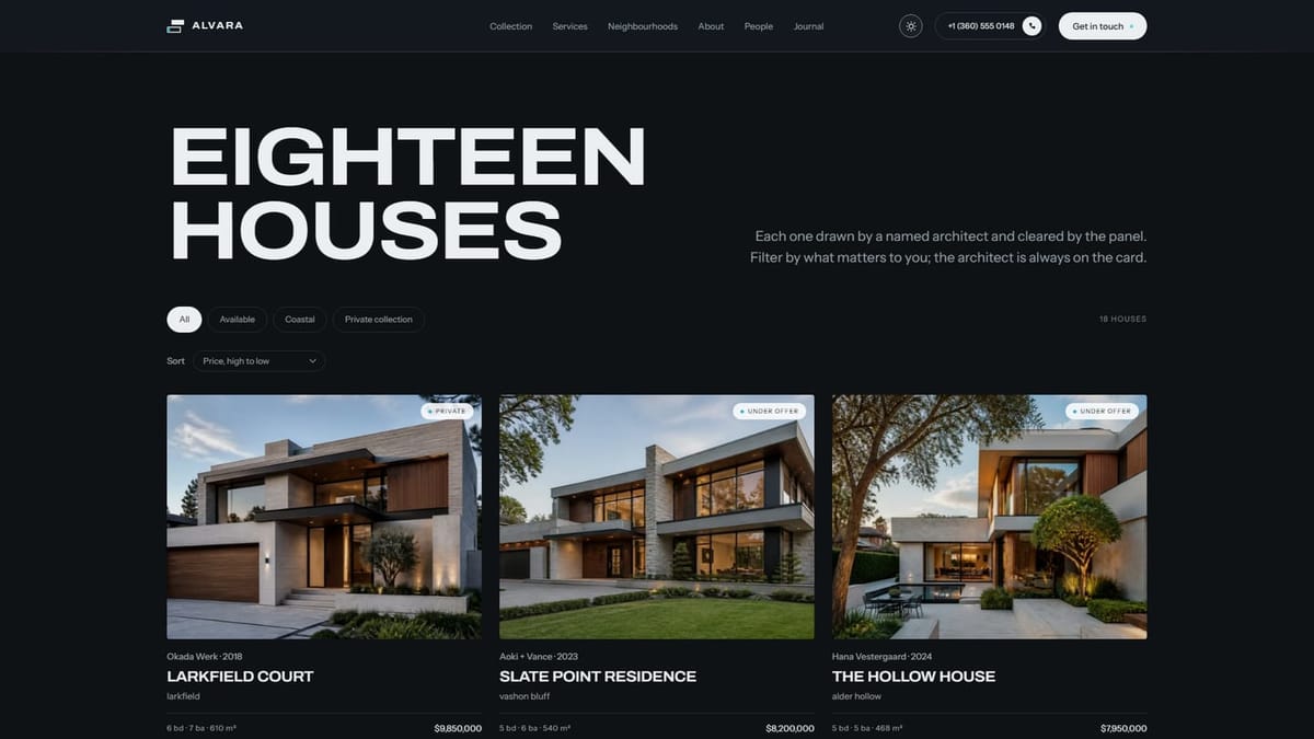
Estate agency websites are organised around filters, floor area and price, which is exactly the language Alvara sells against. Their proposition is authorship: the architect is the product. The site had to read like an architecture publication while still working as a property portal, and had to hold that character across sixteen pages and two themes.
The Approach
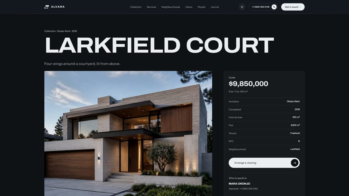
Hand-built rather than assembled from a template, so the typography could carry the editorial weight the positioning needs. Listings lead with the architect and the year the house was completed, with bedroom counts demoted to a supporting line. Photography sits at full width and is never cropped to a uniform card. Light and dark were designed as two finished treatments rather than one inverted into the other.
The Outcome
A property site that reads as a publication and still performs as a portal. The collection, neighbourhood and journal sections give the agency somewhere to argue a position rather than only list stock, and the architect credit runs consistently from the index through to each individual house.
About the Project
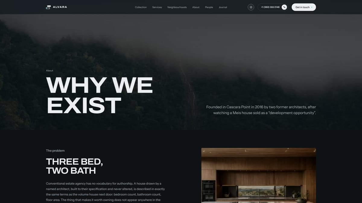
Alvara House is a boutique estate agency on the Pacific Northwest coast representing architect-designed homes, and the site was built to sell the way the agency actually talks. Every listing credits the architect who drew the house and the year it was completed, treating each property as authored work rather than a set of measurements. The design leans editorial throughout — generous type, full-width photography and a restrained palette — so the site reads closer to an architecture publication than a property portal.
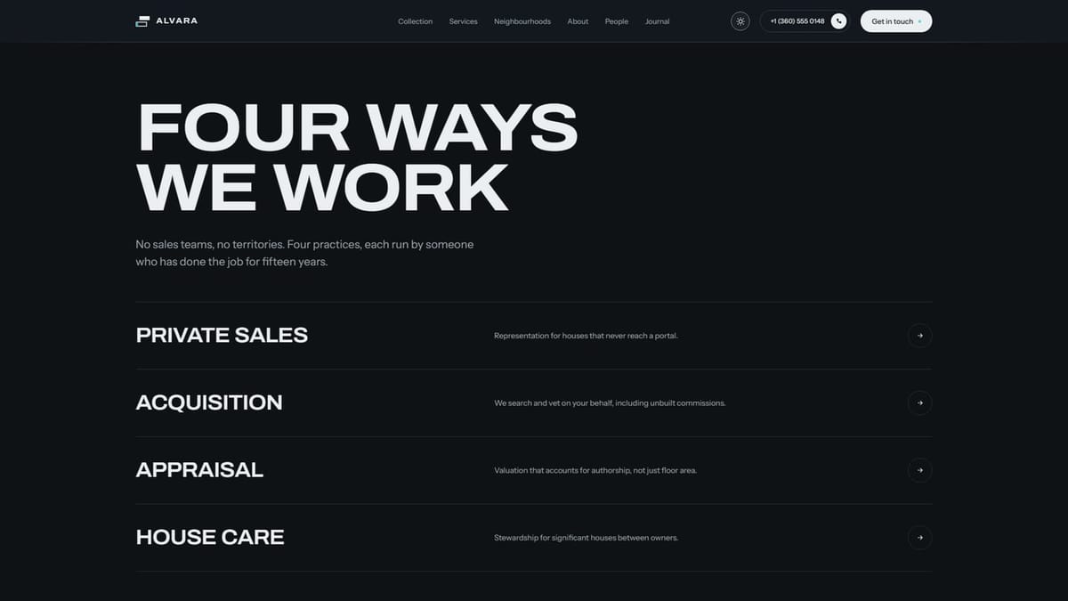
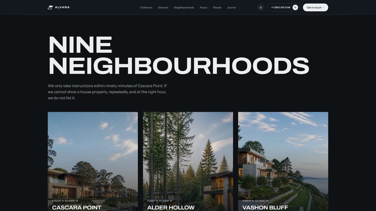
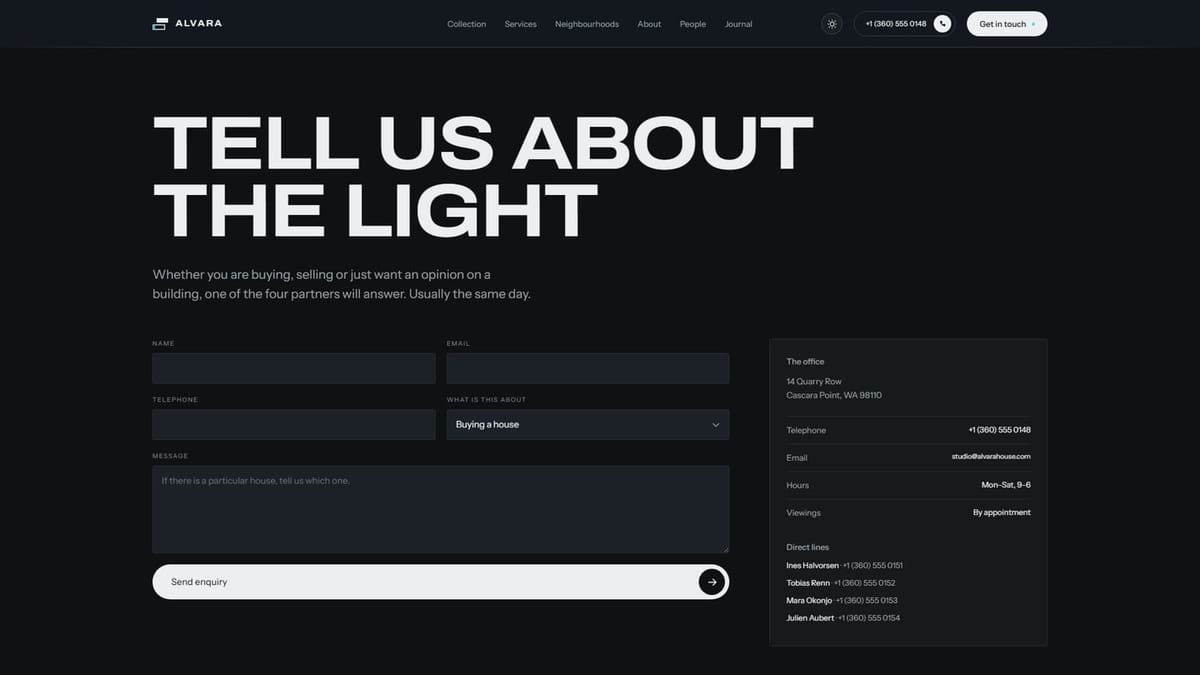
The build runs to sixteen pages: a home page, the full property collection, individual house listings, four service pages, nine neighbourhood guides, partner profiles, a journal with its own article template, careers, an FAQ and the enquiry flow. Each one shares a single type system and grid, so the character holds from the collection index through to a single listing without the layout resetting between sections.
A defining feature is the fully realised dual-theme experience. Light and dark are designed as two finished treatments rather than one inverted into the other, with photography, surface tones and contrast tuned separately in each. Alongside that sit considered scroll and hover motion, a listing architecture that puts authorship above bedroom counts, and an enquiry flow built for a market where buyers ask for drawings rather than brochures.
The result is a property site that reads as a publication and still performs as a portal. The collection, neighbourhood and journal sections give the agency somewhere to argue a position rather than simply list stock, and the architect credit carries consistently from the index through to every individual house.
Pages
 Home
Home About
About Services
 Projects
 Product
 Blogs
Blogs Posts
Posts Contact
 Privacy Policy
Features
 Forms
Forms- Blog
 404 Page
 Custom Code
 Dark/ Light Mode
 Animation