Meridian eCom
Project Overview
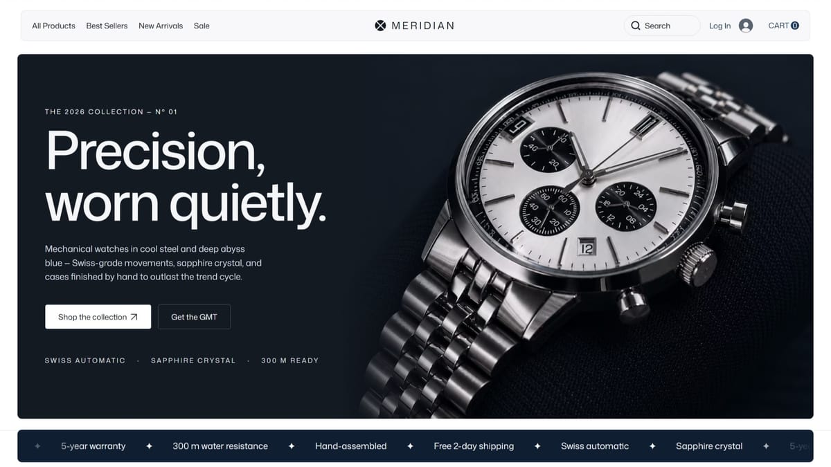
Meridian is a premium eCommerce experience for a Swiss watchmaker, presenting mechanical timepieces across men's, women's, sports, and smart collections through a refined, gallery-like shopping flow built for a slower, more considered kind of browsing.
- Industry
- eCommerce
- Pages
- 8
- Platform
- Wix Studio

The Brief
A Swiss watchmaker needed a store that sells the way a boutique does — unhurried, precise, certain of its worth. Most ecommerce templates optimise for volume and noise; mechanical timepieces need the opposite: room, restraint, and product photography treated like the product itself.
The Approach
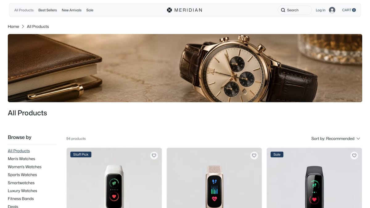
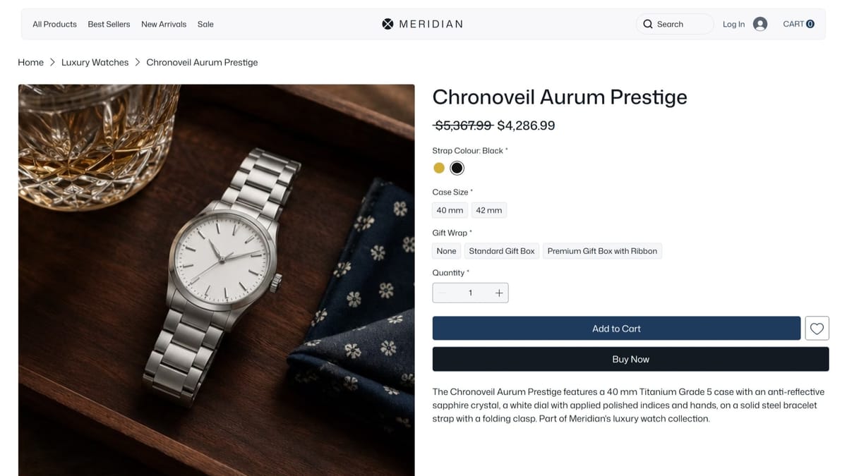
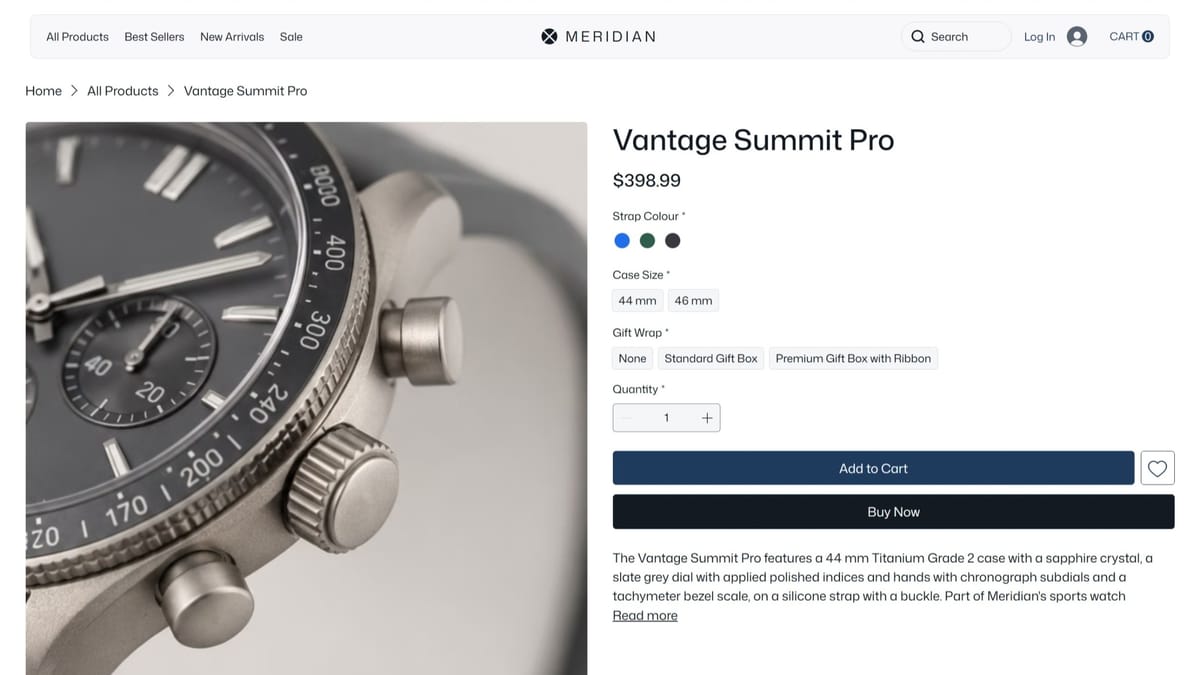
We built a gallery-first storefront in Wix Studio: collections for men’s, women’s, sport, and smart lines, each presented on deep neutral grounds with the watch as the only saturated object on screen. Payments, filtering, and category browsing run on the platform’s commerce layer, so the elegance sits on proven checkout plumbing.
The Outcome
The store reads as a showroom and functions as a machine — browsing feels like being handed the watch, while cart and checkout behave exactly as buyers expect. Collections scale without crowding, and the brand’s restraint survives every screen size.
About the Project
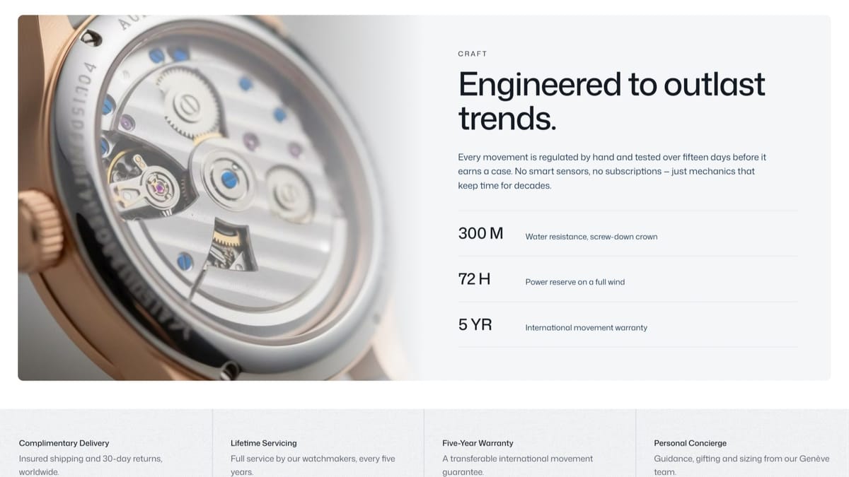
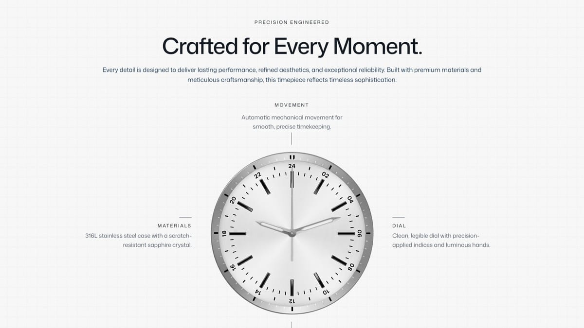
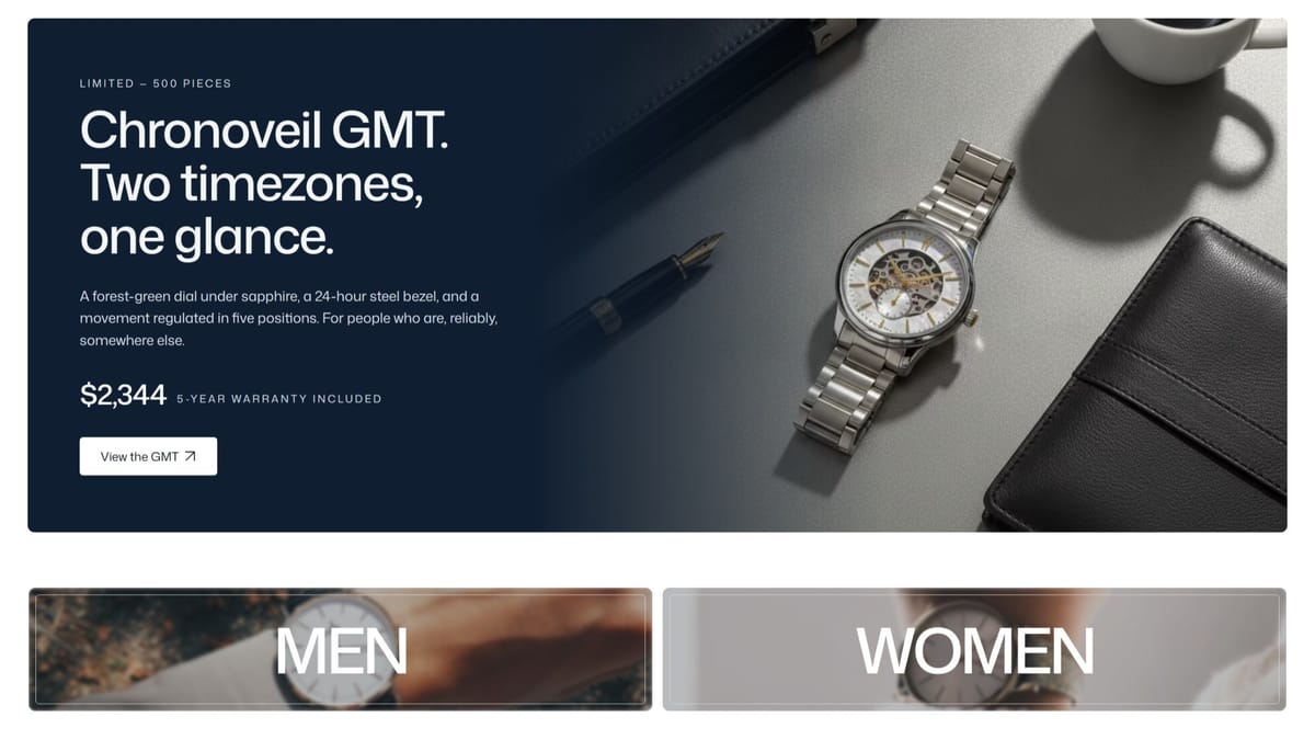
The Meridian website is a full eCommerce build for a fictional Genève watchmaker, designed to feel closer to a boutique showroom than a typical online store. The homepage leads with a cinematic hero and a considered product narrative — "Precision, worn quietly" — before moving into curated collections (Best Sellers, New Arrivals, Sale) and a dedicated craft section that walks through materials, movement, and water resistance.
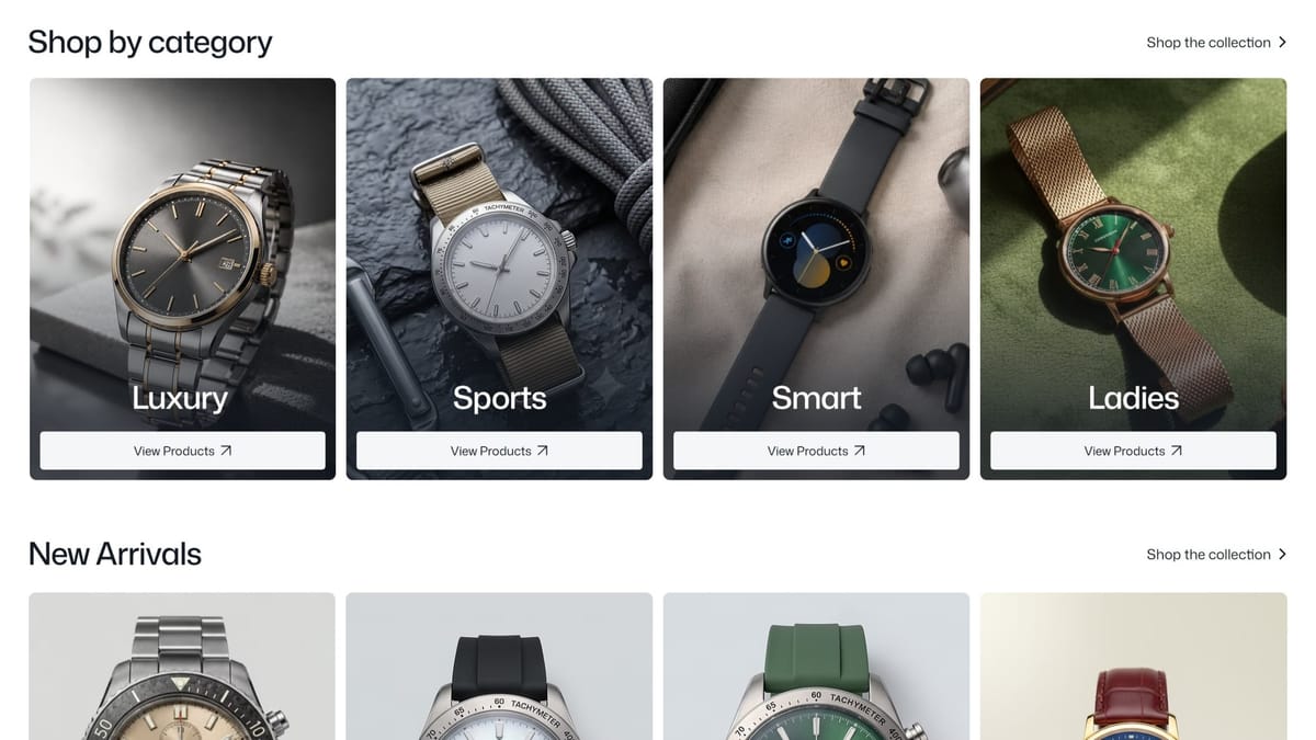
Rather than presenting a flat product grid, the site layers storytelling throughout: a limited-edition GMT spotlight, a five-point craft breakdown, and a concierge-style service section covering warranty, servicing, and delivery. Category navigation (Luxury, Sports, Smart, Ladies) sits alongside a full catalogue, giving the store both a browsable structure and a strong editorial point of view.
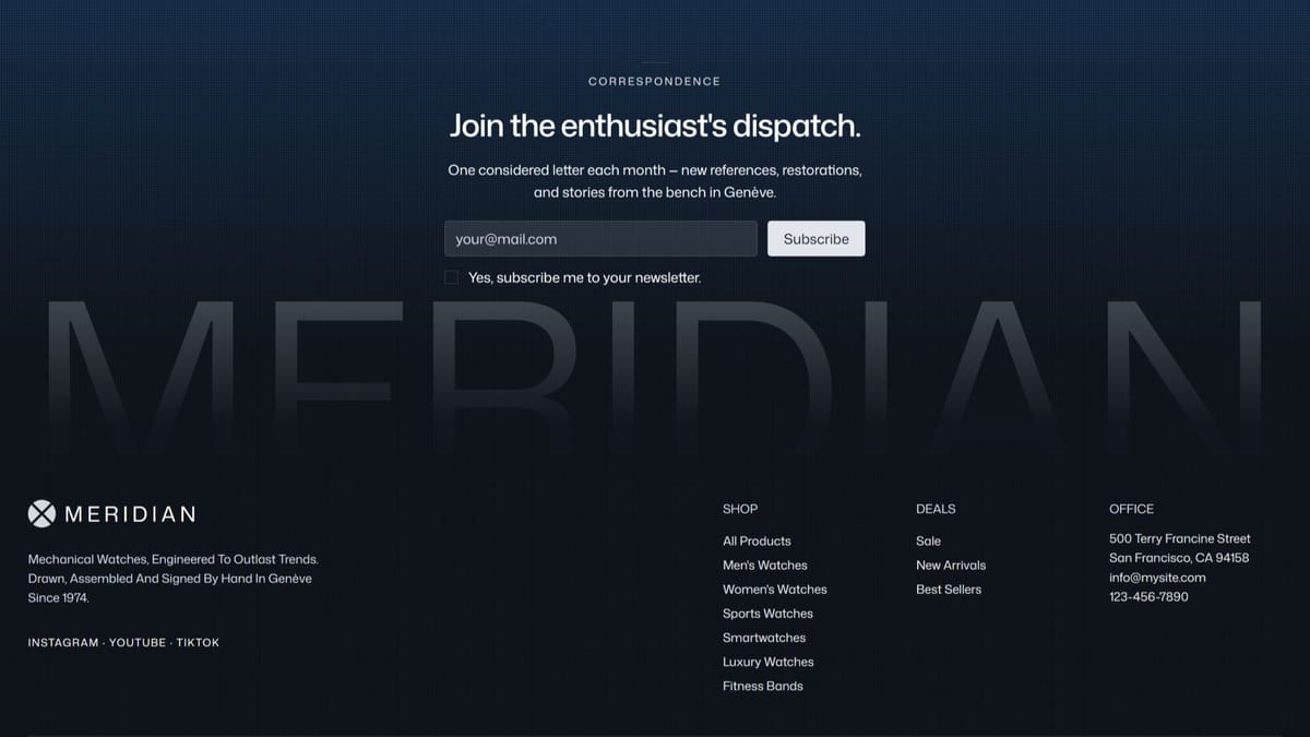
The visual language stays disciplined — deep blues and steel tones, generous whitespace, and typography that reads more editorial than retail — reinforcing the "engineered to outlast trends" positioning. A newsletter capture ("Correspondence") closes the experience, keeping the tone consistent with the rest of the site rather than reading as a bolt-on marketing form.
Pages
 Home
Home Product
 Login
Login Payment
 Privacy Policy
Features
 Payment Integration
 Forms
Forms Store
Store