Consistent Identity
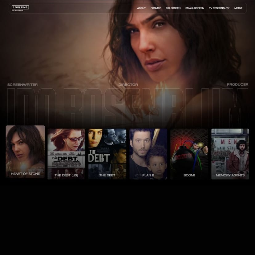
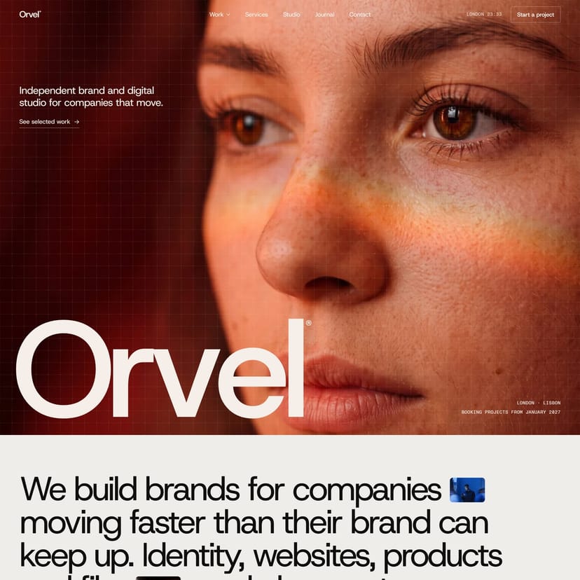
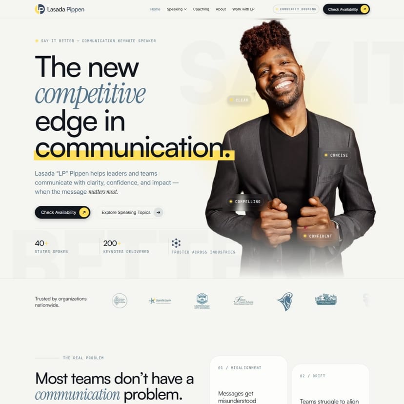
Every project follows a unified design language that reflects brand personality across every touchpoint. Consistency enhances trust and visual harmony.
Inconsistency is the most common reason a professionally built site still feels amateur. Four shades of the same blue, three button styles, headings that change size between pages, spacing decided per section — none of it registers individually, but together it reads as carelessness, and carelessness on a website suggests carelessness elsewhere.
The fix is to stop making those decisions page by page. Colour, type, spacing, radius and elevation are defined once as a system, and every page draws from it. A heading is not eighteen pixels because it looked right that afternoon; it is a step on a scale, and it is the same step everywhere it appears.
The same applies to components. Buttons, cards, form fields, navigation and footers are built once and reused, so a change to the button style updates every button on the site rather than the ones somebody remembers. That is what makes a large site stay coherent, and what keeps it coherent a year later when new pages have been added by someone else.
Consistency also does real accessibility work. A system with defined colour roles can be checked for contrast once rather than argued about per page, and a defined type scale keeps body text at a readable size instead of shrinking wherever space got tight.
This is included in every build here rather than sold as an extra. It is listed separately because it is the part clients most often did not know to ask for, and the part they notice most once it is there.
What’s included
- Uniform color and typography system
- Reusable components and layout standards
- Consistent design across all pages
- Accessibility and visual balance
- Defined colour roles checked for contrast
Need this for your project?
Tell us where you are and we will tell you what it takes.