Forma
Project Overview
- Industry
- SaaS
- Pages
- 12
- Platform
- Custom Code

The Brief
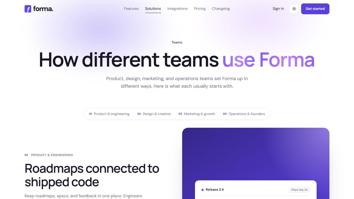
A SaaS marketing site is judged on completeness, not just its hero — a buyer wants to see pricing, integrations, and security posture before they trust a product with their team's data, and most landing-page demos stop at the homepage.
The Approach
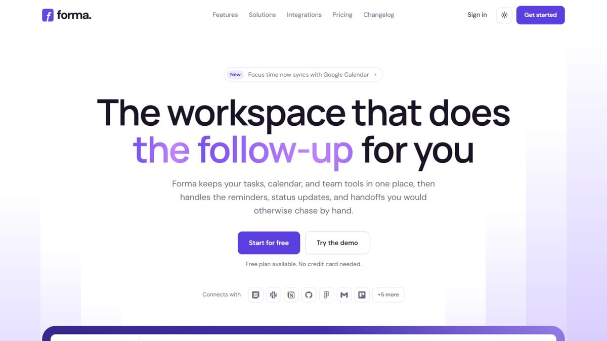
Forma was built as twelve full pages rather than one, sharing a single dashboard mockup as the visual through-line. Dark and light themes were designed natively side by side, never one simply inverted from the other.
The Outcome
The result reads as a shipped product rather than a mockup: a visitor moves from the headline through features and pricing into a real sign-up flow, landing on a dashboard preview that matches what was promised.
About the Project
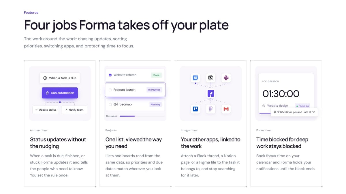
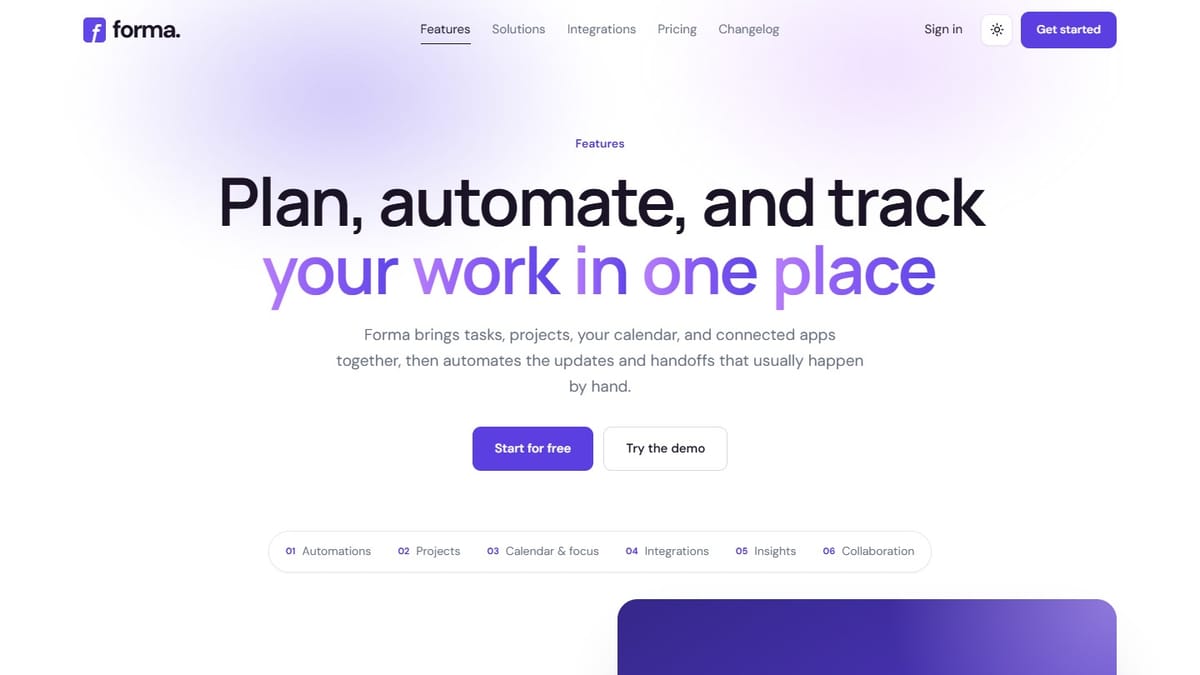
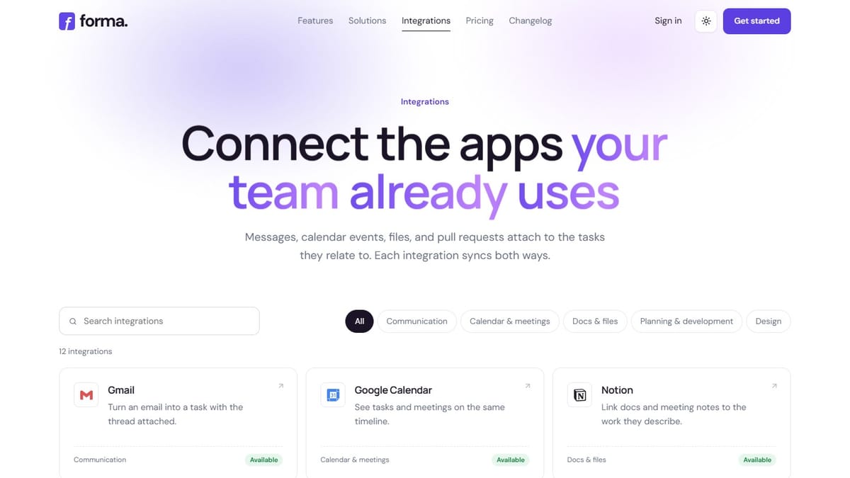
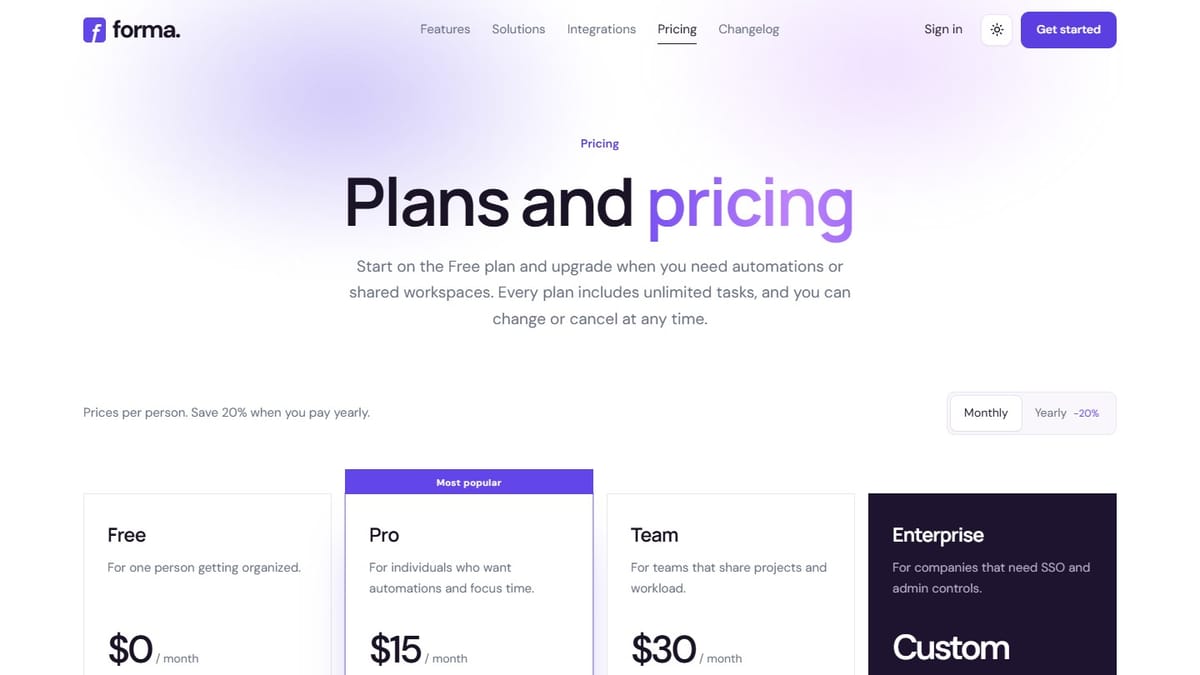
Twelve pages carry the story end to end: a marketing home, Features, Solutions by team, a public Integrations directory, three-tier Pricing, a Changelog that reads like a real one, and Security and legal pages that make the product feel shipped.
The interface runs natively in both a dark and a light theme rather than one inverted from the other, with a purple gradient and the same card language carried consistently from the hero through the pricing table to the dashboard mockups.
An animated product dashboard — task counts, a focus-time chart, a due-today list — stands in for the real app throughout the site, so a visitor evaluates something concrete rather than a single static screenshot on the homepage.
Pages
 Home
Home About
About Contact
 Login
Login Privacy Policy
Features
 Forms
Forms 404 Page
 Custom Code
 Dark/ Light Mode
 Animation